Commercial
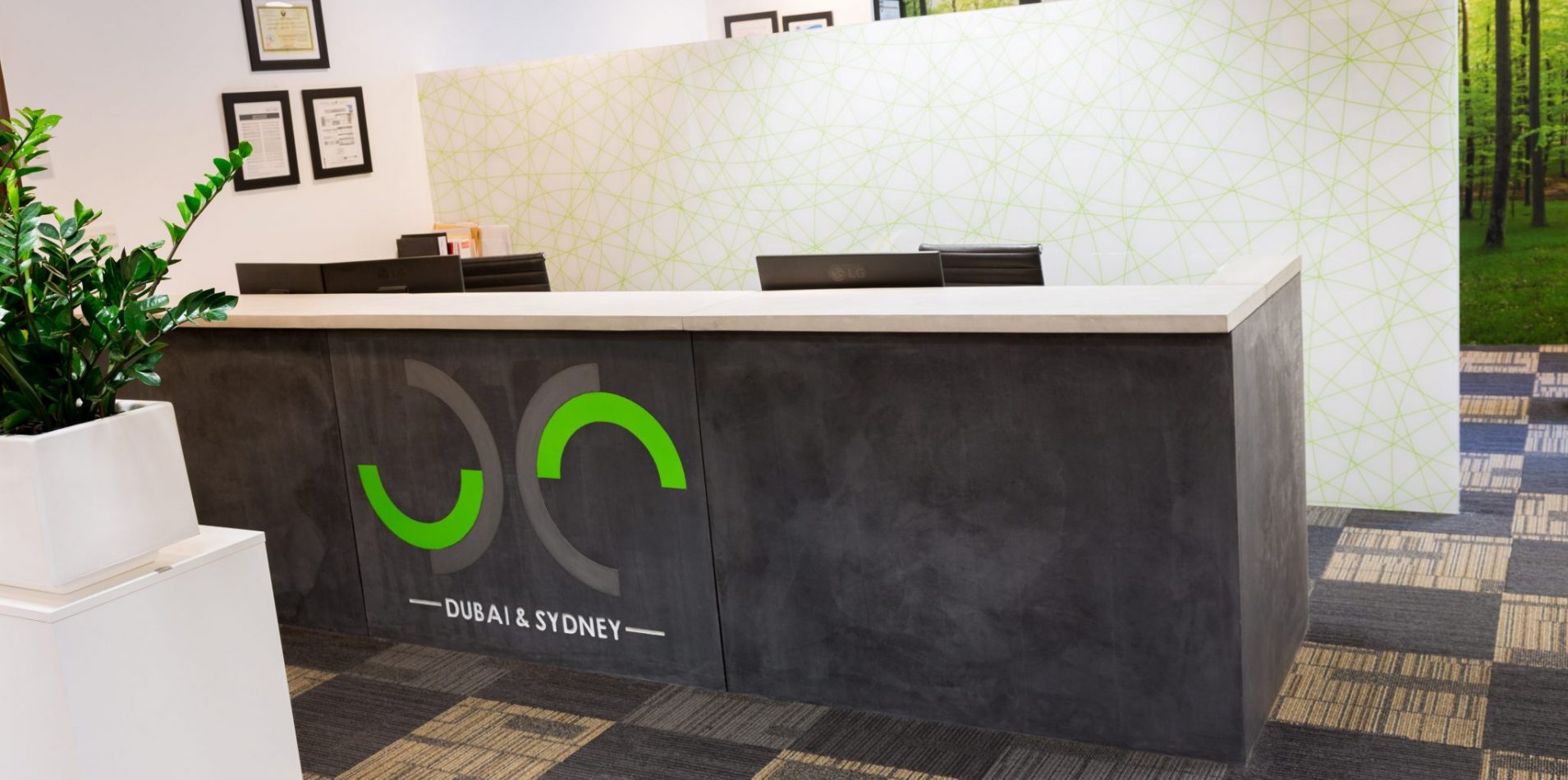
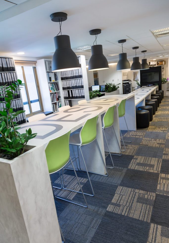
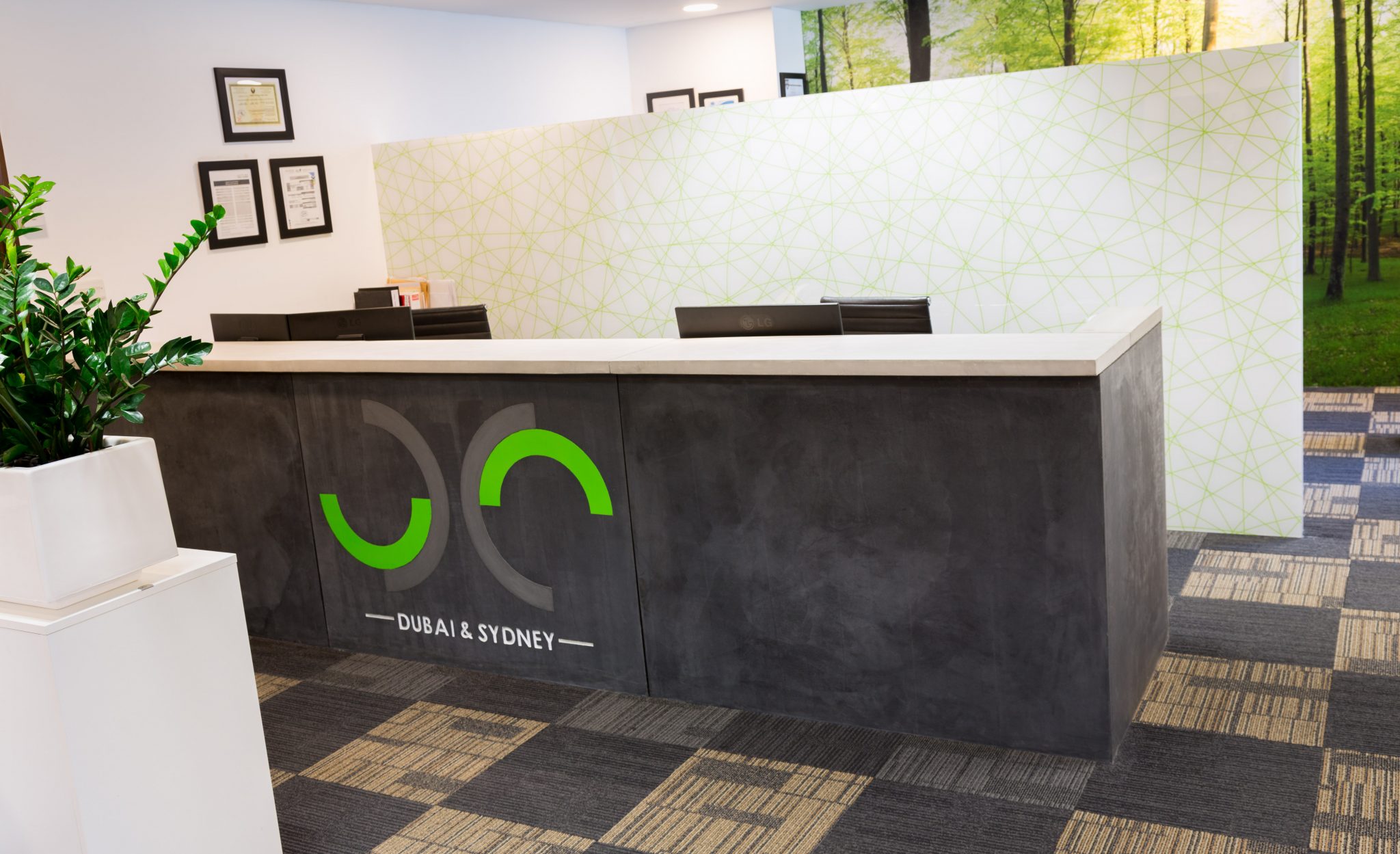
The brief for this office space was to create a light and bright, youthful yet professional, strongly branded look for an expanded company. Better storage and spatial planning were required. Also needed was a separate office for the managing director, a reception, an area for library and cataloguing, a coffee and pantry zone and an integrated meeting area.
Design Confidence
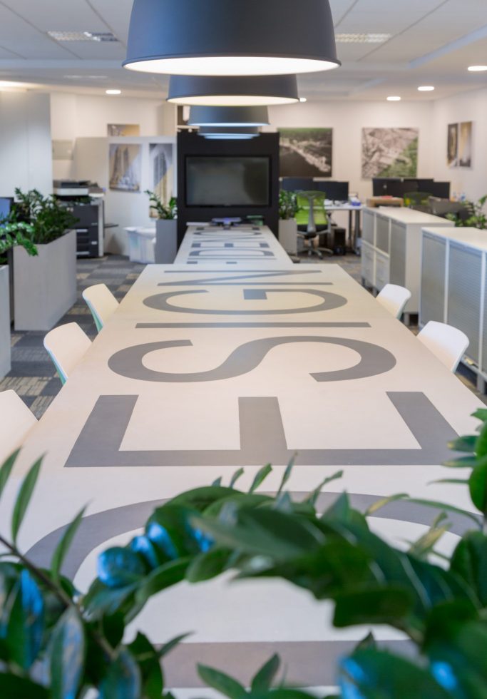
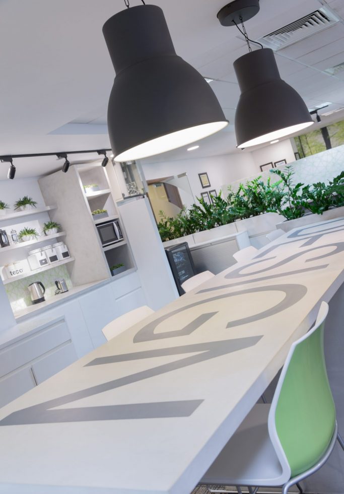
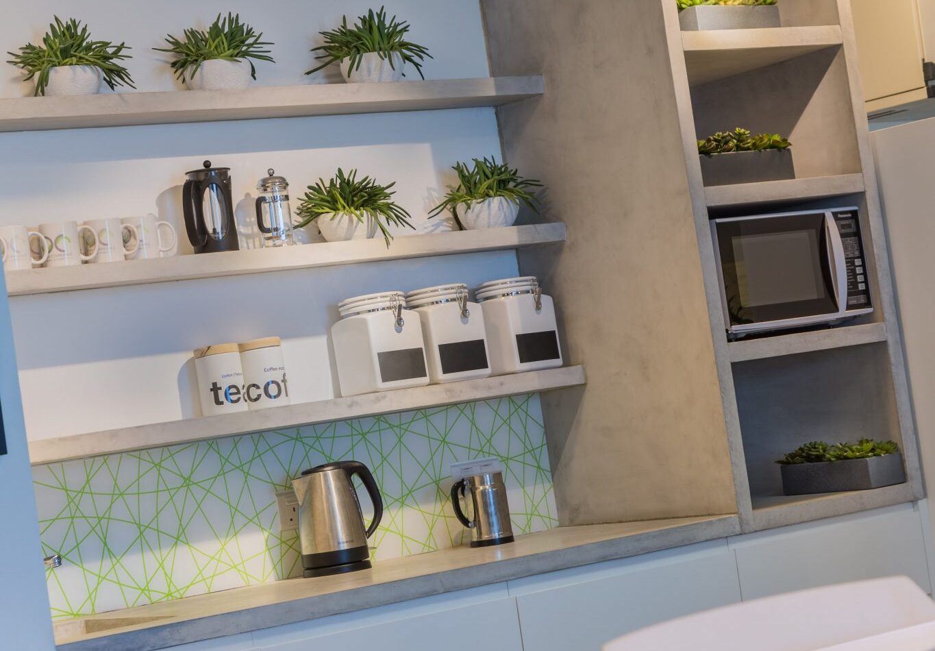
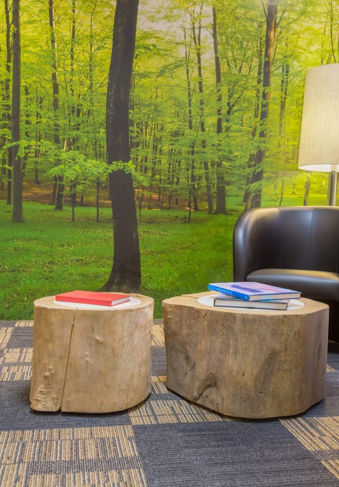
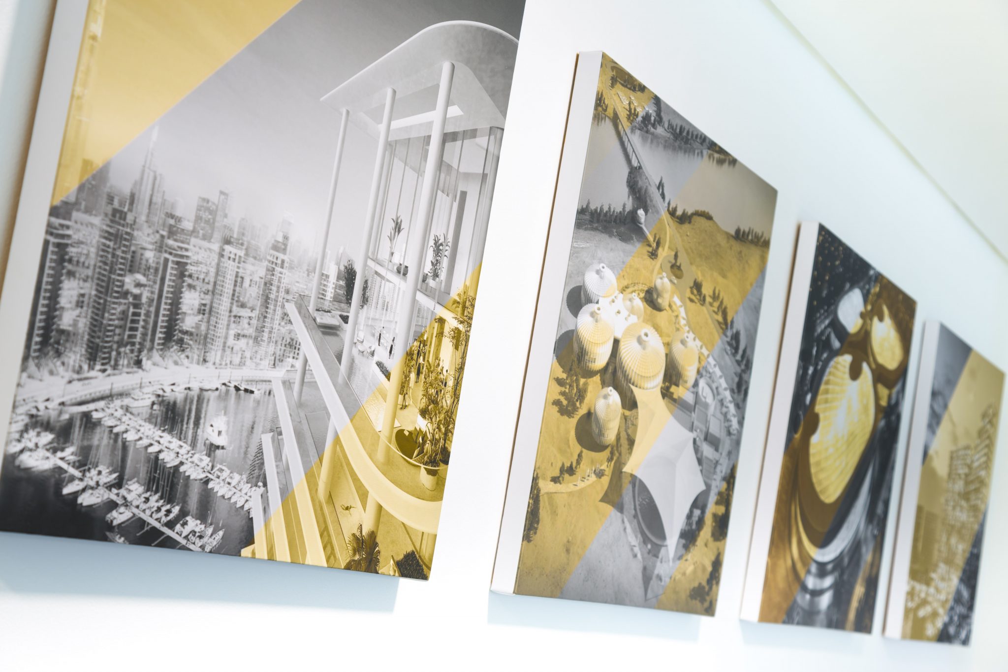
This was to be a minimalist space exuding functional, impactful, professional simplicity that made an instant impression, created a sense of scale of operations, and linked two companies working side by side. Extra features introduced included decorative lighting, mounted pictures of previous successful projects, a use of the corporate colours of green and black, a custom-made, branded large-scale concrete table, inspiring forest wallpaper and an open pantry with high-top stools.

